Desktop Apps with Electron, React and SQLite
Learn how to create efficient and powerful desktop applications using Electron, React, and SQLite. Discover the benefits of this winning combination and enhance your productivity today.


This post is an improvement of this post (in Portuguese) and the last part, covers the SQLite integration.
First, let's start from the beginning (again) without wasting any more time.
I made a small update on this post at out 2023 to fixes the build with electron and SQLite, check the discus here.
Project Overview
A TO-DO is an awesome idea for this project, so let's create something like the "Microsoft To-do".
We will use:
- Electron is an open-source project that allows developers to create Desktop apps with Web technologies.
- React, your UI/Components library.
- SQLite, a portable SQL database.
Starting the project
To accelerate your development, let's use a React + Electron boilerplate, this will save a lot of time of setup and organize your base project.
# Clone the boilerplate:
git clone --depth=1 \
  https://github.com/electron-react-boilerplate/electron-react-boilerplate \
  todo-clone

cd todo-clone

# Install dependencies:
npm install
Cloning your boilerplate and install de inicial dependencies.
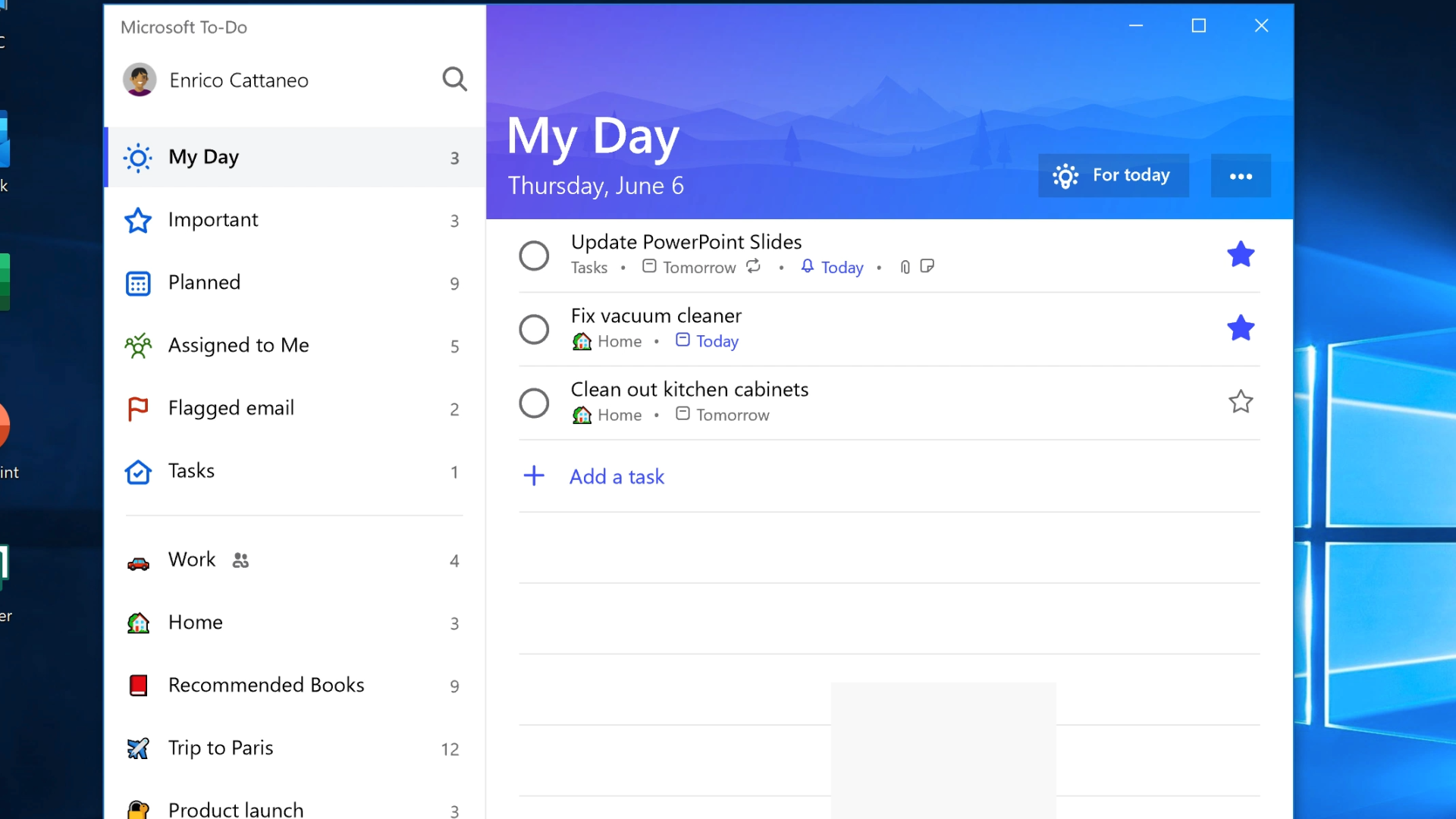
After installation was complete, you can run npm start and see the default boilerplate page:
If we open the project in a code editor, we will see this folder structure:
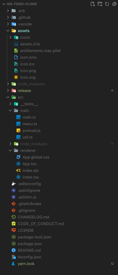
By default, the boilerplate comes with CSS Modules, React Router Dom, and the testing-library.

Starting the UI
Let's start organizing the project to place our files in the right place, first, inside of src/renderer create three folders: components, styles, and views.
Now delete the App.tsx and create the routes.tsx, rename the App.css to App.global.css, and move to the styles folder.
Inside the views folder, create the Home folder and inside it creates index.tsx, and Home.module.css.
Create default.css inside styles/themes folder (create the themes folder too).
Now, let's see the code for each file:
src/renderer/styles/App.global.css:
@import './themes/default.css';

* {
  padding: 0;
  margin: 0;
  font-family: var(--font);
}

.button {
  background-color: var(--primary-color);
  border: none;
  margin: 5px;
  font-size: 0.7rem;
  padding: 5px 10px;
  border-radius: 4px;
  color: var(--text-color);
}

.button:hover {
  opacity: 0.8;
  cursor: pointer;
}

.button + .secondary {
  background-color: var(--text-cancel-color);
}
src/renderer/styles/themes/default.css:
@import url('https://fonts.googleapis.com/css2?family=Roboto:wght@100;300&display=swap');

:root {
  --primary-color: #788cde;
  --secondary-color: #323232;
  --background-color: #282828;
  --alternate-background-color: #1e1e1e;

  --text-color: #e1e1e1;
  --text-color-light: #777676bb;
  --font: Roboto;

  --text-cancel-color: #dd2a2c;

  --link-color: #e1e1e1;
  --link-color--hover: #543fd7;
}
src/renderer/index.tsx:
import './styles/App.global.css';
import { createRoot } from 'react-dom/client';
import Routes from './routes';

const container = document.getElementById('root') as HTMLElement;
const root = createRoot(container);
root.render(<Routes />);
src/renderer/routes.tsx:
import { MemoryRouter, Route, Routes } from 'react-router-dom';

import Home from './views/Home';

export default function appRoutes() {
  return (
    <MemoryRouter>
      <Routes>
        <Route path="/" Component={Home} />
      </Routes>
    </MemoryRouter>
  );
}
Now, let's see the components' part, inside components create these folders; Sidebar, Logo, TaskArea and TaskItem. For each one, create the index.tsx and {ComponenteName}.module.tsx.
src/renderer/components/Sidebar/index.tsx:
import Logo from '../Logo';

import styles from './Sidebar.module.css';

export default function Sidebar() {
  return (
    <div className={styles.sidenav}>
      <Logo />
      <a href="#">Meu dia</a>
      <a href="#">Importante</a>
      <a href="#">Planejado</a>
      <a href="#">Trabalho</a>
    </div>
  );
}
src/renderer/components/Sidebar/Sidebar.module.css:
@import '../../styles/themes/default.css';

.sidenav {
  width: 240px;
  height: 100vh;
  background: var(--background-color);
  overflow-x: hidden;
  padding-left: 10px;
}

.sidenav a {
  padding: 10px;
  text-decoration: none;
  font-family: var(--font);
  font-size: 1.1rem;
  color: var(--link-color);
  display: block;
}

.sidenav a:hover {
  background-color: var(--alternate-background-color);
}
Now is the time to create our Task components, create components/TaskArea and components/TaskItem. Rember to create our default files (index and CSS).
TaskArea/index.tsx:
import TaskItem from '../TaskItem';

import styles from './TaskArea.module.css';

export type TODO = {
  id?: number;
  title: string;
  date: string;
  status: number;
};

export default function TaskArea({
  todos,
  onCheck,
  onDelete,
  onEdit,
}: {
  todos: TODO[];
  onCheck: (id: number) => void;
  onDelete: (id: number) => void;
  onEdit: (id: number) => void;
}) {
  return (
    <div className={styles.container}>
      {todos.map((todo) => (
        <TaskItem
          checked={todo.status === 1 ? true : false}
          date={todo.date}
          label={todo.title}
          key={todo.id}
          id={todo.id}
          onChange={onCheck}
          onDelete={onDelete}
          onEdit={onEdit}
        />
      ))}
    </div>
  );
}TaskArea/TaskArea.module.css:
@import '../../styles/themes/default.css';

.container {
  display: flex;
  flex-direction: column;
  width: 100%;
  padding: 10px;
  background-color: var(--alternate-background-color);
}
TaskItem/index.tsx:
import { format } from 'date-fns';
import styles from './TaskItem.module.css';

export type TaskItem = {
  label: string;
  date: string;
  id: number;
  checked: boolean;
  onChange: (id: number) => void;
  onEdit: (id: number) => void;
  onDelete: (id: number) => void;
};

export default function TaskItem({
  date,
  label,
  id,
  checked,
  onChange,
  onDelete,
  onEdit,
}: TaskItem) {
  function handleCheck() {
    onChange(id);
  }

  function handleEdit() {
    onEdit(id);
  }

  function handleDelete() {
    onDelete(id);
  }

  return (
    <div
      className={`${styles.container} ${checked ? styles['task-finish'] : ''}`}
      id={`${id}`}
    >
      <input
        className={styles.checkbox}
        type="checkbox"
        checked={checked}
        onChange={handleCheck}
      />
      <div className="col">
        <p className={styles['task-label']}>{label}</p>
        <p className={styles['task-date']}>
          {format(new Date(date), "E., dd 'de' MMM")}
        </p>
        <div>
          <button className="button" onClick={handleEdit}>
            Editar
          </button>
          <button className="button secondary" onClick={handleDelete}>
            Deletar
          </button>
        </div>
      </div>
    </div>
  );
}
TaskItem/TaskItem.module.css
@import '../../styles/themes/default.css';

.container {
  display: flex;
  align-items: center;
  background-color: var(--secondary-color);
  padding: 10px 20px;
  margin: 1px 0px;
  color: var(--text-color);
  font-family: var(--font);
  border-radius: 6px;
}

.container > :nth-child(1) {
  margin-right: 15px;
}

.task-label {
  font-size: 0.85rem;
  color: var(--text-color);
}

.task-date {
  font-size: 0.85rem;
  color: var(--text-cancel-color);
  font-weight: bold;
}

.task-finish .task-label {
  text-decoration: line-through;
}

input[type='checkbox'] {
  -webkit-appearance: none;
  appearance: none;
  background-color: var(--alternate-background-color);
  margin: 0;
  font: inherit;
  color: currentColor;
  width: 1.35em;
  height: 1.35em;
  border: 0.15em solid var(--background-color);
  border-radius: 50px;
  transform: translateY(-0.075em);
  display: grid;
  place-content: center;
}

input[type='checkbox']::before {
  content: '';
  width: 0.55em;
  height: 0.55em;
  clip-path: polygon(14% 44%, 0 65%, 50% 100%, 100% 16%, 80% 0%, 43% 62%);
  border-radius: 50px;
  transform: scale(0);
  transform-origin: bottom left;
  transition: 120ms transform ease-in-out;
  box-shadow: inset 1em 1em var(--background-color);
  background-color: var(--background-color);
}

input[type='checkbox']:checked::before {
  transform: scale(1);
}

input[type='checkbox']:checked {
  background-color: var(--primary-color);
}

input[type='checkbox']:focus {
  outline: max(2px, 0.15em) solid currentColor;
  outline-offset: max(2px, 0.15em);
}

input[type='checkbox']:disabled {
  color: var(--primary-color);
  cursor: not-allowed;
}
Create the Logo componente (folder, files etc):
import styles from './Logo.module.css';

export default function Logo() {
  return <h1 className={styles.logo}>TODO Clone</h1>;
}
@import '../../styles/themes/default.css';

.logo {
  color: var(--primary-color);
  margin: 20px 0px;
  font-family: var(--font);
  font-weight: 800;
}
The Modal component:
import { useState } from 'react';
import styles from './Modal.module.css';
import { TODO } from '../TaskArea';
export type Modal = {
initialData: TODO | undefined;
onClose: () => void;
onSave: (item: TODO) => void;
};
export default function Modal({ onClose, initialData, onSave }: Modal) {
const [title, setTitle] = useState(initialData?.title || '');
function handleOnSave() {
if (title === '') {
alert('Invalid title');
return;
}
onSave({
title,
date: initialData?.date || new Date().toLocaleString(),
status: initialData?.status || 0,
id: initialData?.id,
});
}
return (
<div className={styles.modal}>
<div className={styles.modal_content}>
<span className={styles.close} onClick={onClose}>
×
</span>
<h2>New task</h2>
<div className={styles.formGroup}>
<label>Title</label>
<input value={title} onChange={(el) => setTitle(el.target.value)} />
</div>
<button className="button" onClick={handleOnSave}>
Save
</button>
<button className="button secondary" onClick={onClose}>
Cancel
</button>
</div>
</div>
);
}
@import '../../styles/themes/default.css';


.modal {
  display: block; /* Hidden by default */
  position: fixed; /* Stay in place */
  z-index: 1; /* Sit on top */
  padding-top: 100px; /* Location of the box */
  left: 0;
  top: 0;
  width: 100%; /* Full width */
  height: 100%; /* Full height */
  overflow: auto; /* Enable scroll if needed */
  background-color: rgb(0,0,0); /* Fallback color */
  background-color: rgba(0,0,0,0.4); /* Black w/ opacity */
  color: var(--text-color);
}

.modal_content {
  background-color: var(--background-color);
  margin: auto;
  padding: 20px;
  border: 1px solid var(--primary-color);
  width: 50%;
}

/* The Close Button */
.close {
  color: var(--text-cancel-color);
  float: right;
  font-size: 28px;
  font-weight: bold;
}

.close:hover,
.close:focus {
  color: #000;
  text-decoration: none;
  cursor: pointer;
}

.formGroup {
display:flex;
flex-direction: column;
margin: 10px 0px
}

.formGroup > input {
    font-size: 1rem;
    padding: 5px;
    margin: 5px 0px;
    border: 1px solid;
    border-radius: 4px;
    border-color: var(--primary-color);
    background-color: var(--secondary-color);
    color: var(--text-color);
}
Back to the views folder, let's put the Home code:
import TaskArea, { TODO } from '../../components/TaskArea';
import Sidebar from '../../components/Sidebar';
import FAB from '../../components/FAB';
import Modal from '../../components/Modal';

import styles from './Home.module.css';
import { useState } from 'react';

export default function Home() {
  const [modal, setModal] = useState(false);
  const [todos, setTodos] = useState<TODO[]>([
    {
      id: 1,
      date: new Date().toLocaleString(),
      status: 1,
      title: 'Test',
    },
    {
      id: 2,
      date: new Date().toLocaleString(),
      status: 0,
      title: 'Test 2',
    },
  ]);
  const [edit, setEdit] = useState<TODO>();

  function onSave(todo: TODO) {
    const update = todos.find((el) => el.id === todo.id);
    if (update) {
      const updatedTodos = todos.map((el) => {
        if (el.id === todo.id) {
          return todo;
        }

        return el;
      });
      setTodos(updatedTodos);
    }

    setTodos([...todos, todo]);
    toggleModal();
  }

  const onCheck = (id: number) => {
    const newState = todos.map((todo) => {
      if (todo.id === id) {
        return {
          ...todo,
          status: todo.status === 1 ? 0 : 1,
        };
      }

      return todo;
    });

    setTodos(newState);
  };

  function onDelete(id: number) {
    setTodos(todos.filter((todo) => todo.id !== id));
  }

  function onEdit(id: number) {
    const editTodo = todos.find((todo) => todo.id === id);
    if (editTodo) {
      setEdit(editTodo);
    }

    toggleModal();
  }

  function toggleModal() {
    if (modal) {
      setEdit(undefined);
    }

    setModal(!modal);
  }

  return (
    <div className={styles.container}>
      <Sidebar />
      <FAB onClick={toggleModal} />
      {modal && (
        <Modal onClose={toggleModal} onSave={onSave} initialData={edit} />
      )}
      <TaskArea
        todos={todos}
        onCheck={onCheck}
        onDelete={onDelete}
        onEdit={onEdit}
      />
    </div>
  );
}
.container {
  display: flex;
  flex-direction: row;
}
Go to your terminal and run the start script:
yarn start
#or
npm script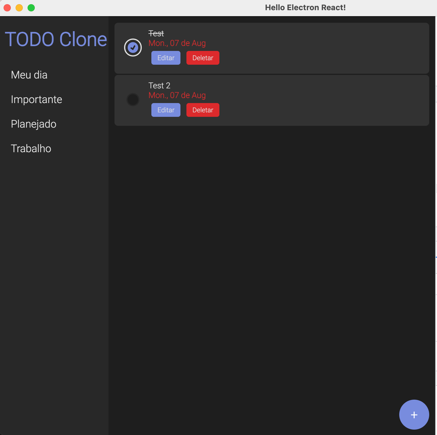
This is what we have from the previous post (with many improvements).
SQLite
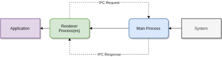
It's time to create and connect to an SQLite database and create the CRUD for the TODOs. At this point I need to explain a little bit about Electron process, in Electron we have two kinds of process, the main process and the renderer process.
- Main process: It's the entry point of every Electron application, controlling the life cycle, native elements, spawn new renderer process, and more. We have full Nodejs API. Is like the "backend" part of our project.
- Renderer process: This is the UI part; we can think about it like this is a "frontend" part of your project. We don't have access to full Nodejs APIs, like file systems, DB connections, or something like that.
So, who we can communicate between this process? With IPC! Electron use inter-process communication to send and receive serialized JSON between the main and renderer processes.